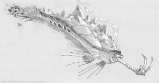
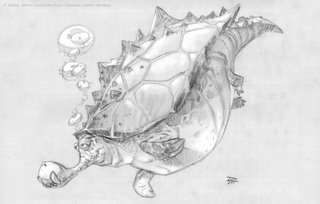
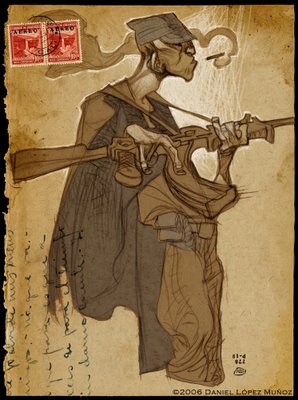
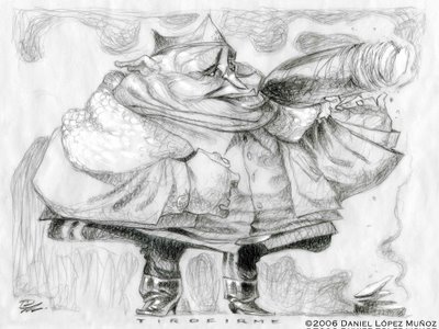
These are pages 2 and 3 from my story "Silent Echoes", part of the Out of Picture Anthology. mixed media
9 x 13
The success of the "Out of Picture" Anthology continues to show its fruit.
Many of us who have been involved in this collaborative art book are presently showcased in the 49th Annual Exhibition at The Society of Illustrators in New York.
The photograph bellow represents pages 2 and 3 from my story that were sent to the show in NY.
I took a little extra time and built the frame myself in an effort to pay tribute to our friend Dice and to the "Out of Picture" circle of artists friends. "Wootie"(in close up) was created by Dice as the symbol for the book. It has come to represent our group. The engraving of Wootie on the frame that holds my piece is my homage to him and to our group of artists in this ongoing and exciting project.
Before getting into the thick of things, I must apologize for the lack of postings this last month and more importantly for my lack of response to some of your comments. Soon, I promise to contact those of you who have tried to reach me through this blog.
The image bellow, is a portion of a larger development image for my upcoming contribution to the next "Out of Picture" anthology, currently in development

These series I did for the Movie ROBOTS some years ago.
In retrospect I know now that this movie was more fun to research and design for, than it was to watch.
We spend a long time developing the world that these robots lived in. We looked at the history of everything "machine", from the advent of the industrial revolution which brought about the machine age, to today's computer manufactured machines (machines that build machines). What this meant is that we had to be faithful to the materials and technology of each of these eras. Ultimately we divided the world into 4 mayor periods:
STEAM, COMBUSTION, ELECTRIC and HI-END.
Architecturally, it echoed human architecture, at least in how we view them emotionally. It most certainly aimed to express a nostalgia for American cultural history. Contrasting the romanticism of early American culture and the skepticism of today. The Star of the film had to remind us of all that we loved about the past in a way that could also inspire the future. Someone of traditional values with present ambitions.
The world around him needed to support all this as well. Ultimately, I think the story failed to support the star of the film and the robot world. I can only speak for that which I was called to do, and say simply that it came down to the budget , the pacing of the film and the studio's lack of faith for the original story.
80% of the architectural potential never could be realized in 3D within budget and the accelerated pace of the film prevented it from taking its time to accurately portray the contrast between the more nostalgic world that the star of the film came from and the precipitous bustle of the world that he came to inhabit. Ultimately all machines worked equally as fast, or not at all. Like all the steam and moving mechanisms we wanted for the depths of the city. Originally intended to look, feel and work like an old watch. Sadly, since only 20% of the architecture was ultimately built, there was only so much we could hope for.
Lack of Budget, lack of resources... Our mistake was designing a movie that was clearly well out of budget.
images © 2005 20th century fox film
Small town Steam era (Above). Pencil/digital.
Big city Steam era (Above left) and Hi-End (Above right). Pencil/digital.
Big city Steam era (Above). Villain's Lair. Pencil/digital.
Big city Electric & High-End (Above). Pencil/digital.
Because the robot city was intended to have been built from the ground up, this presented us with the opportunity to build the next modern era above the previous one. Thus, allowing us to echo the kind of eclectic architecture prevalent in Europe today. Modern structures built directly upon gothic bases, for example. The difference was that we would continue to build vertically so that the Hi-End structures reached into the sky while the ancient steam powered architecture rusted away at the core. But again, since only 20% of the architecture could be built in 3D, most of these concepts became blurred.
Those few buildings that did get built in full detail however, are testament to what "could have been". The folks at that studio are of such great talent, it is a shame that they were not better supported by some of the leadership, to accomplish the goals that the artists faithfully set off to achieve.
A friend's project for whom I did a few designs to help pitch the thing to Blue Sky Studios.
9x11
pencil/digital
Before getting into the rhetoric, I want to thank you all for your feedback on my work. Thanks!
So I found myself digging back into some old files and I found these. I worked on this pilot show "3.2.1.Penguins!" six years ago. I have to admit that despite the production limitations (which were very many) it was fun working on it. I got to work with the amazing Michael Spooner who became my mentor. His talent and generosity are not of this world. 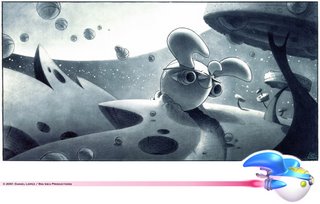
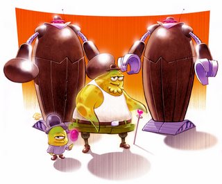
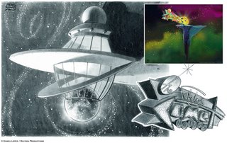
#1 was for the penguins' spaceship, which was probably the most fun to design. Inside and out. I even ended up modeling it in the computer, for the show. I inspired the design from Raymond Loewy's 1934 pencil sharpener.
#2 was for an episode with jelly aliens whose mob boss was this scout leader named Uncle Blob. I created a whole set of characters and gags that ultimately were not used. The only thing that was used from what I proposed for that show was the name of Uncle Blob. Ha! Showbiz baby!
#3 was the Space Lounge where the Penguins would perform the end show musical number as a throwback to Hanna-Barbera's "Banana Splits" show.
